Role UX Manager
Partners Product Management · UX Research · Engineering · QA · Marketing
Deliverables Design System · Documentation
Tools Figma · Sketch · Confluence · InVision DSM
Timeframe Ongoing
No Design System or Documentation: Other than some work in progress from an agency’s work on Valley Direct, there was no digital design system, governing standards, or design files across the board. Some marketing assets, like the icon library, didn’t translate well to digital use cases.
Disconnected Look and Feel: Most of Valley's off-the-shelf solutions have unique component libraries with limited customization capabilities. Stakeholders across the bank who managed these technology platforms had no standards to use or worked in silos, subsequently creating a disjointed visual experience across customer digital touchpoints.
Account Opening Subsystem. Valley Direct — Valley's digital-only banking solution and the first major digital transformation initiative — had a theme different from Valley's parent brand identity. Due to bandwidth and resource challenges, we carried its look and feel across all account opening streams.
Marketing Websites: No design files for Valley.com. Valley's homeowner association website had a different look and feel from the website. Furthermore, the applied color palette impacted accessibility conformance.
Before we did anything, we had to understand where we were in our design system maturity. The team thoroughly analyzed the bank’s existing digital platforms, user feedback, and industry standards to identify common patterns and areas for improvement.
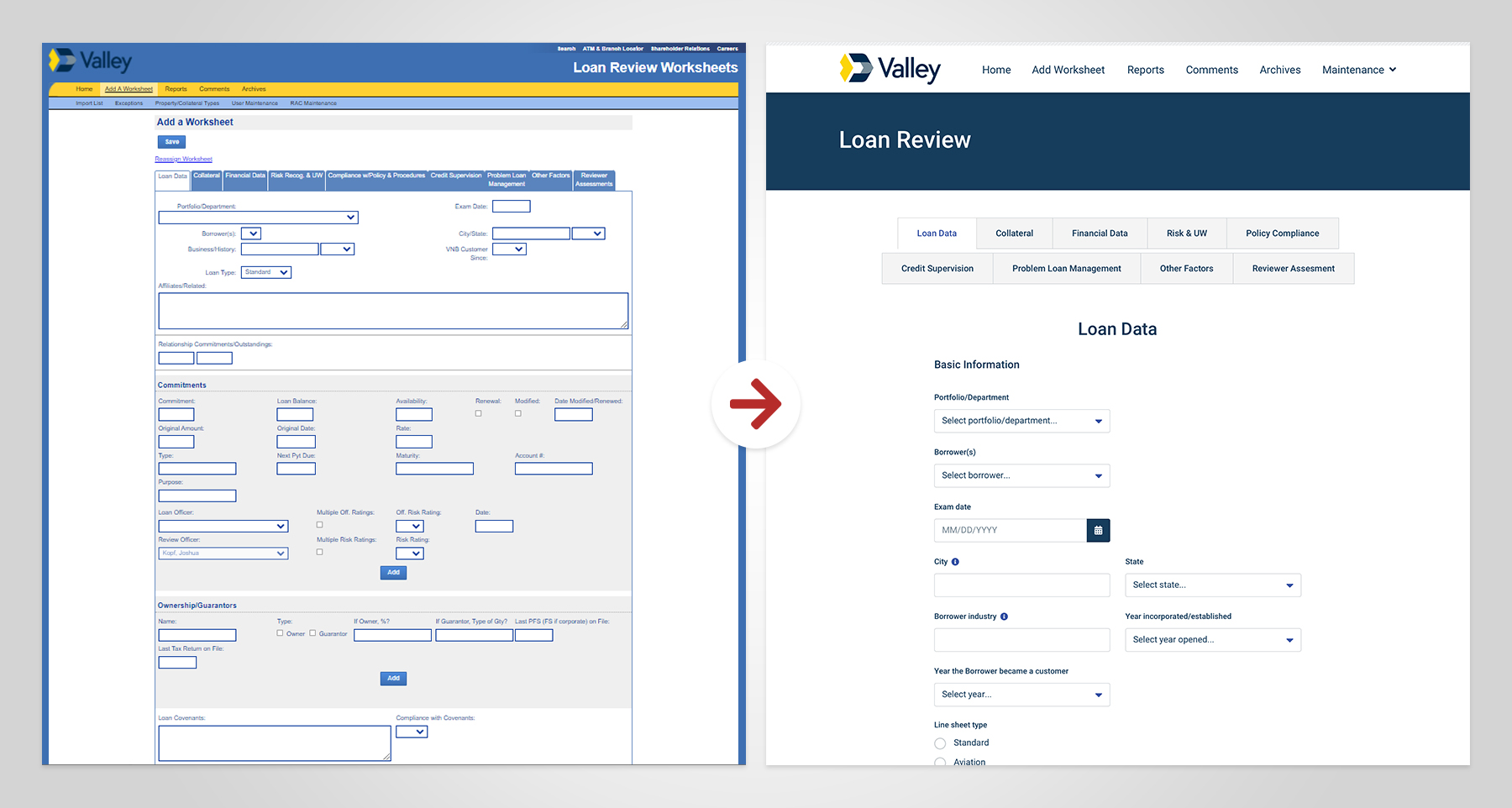
Since we had limited control over the components of off-the-shelf solutions, we learned that one major customer frustration point involved error messaging, a lack of helpful on-screen content, and components that invited interaction when they were indeed unclickable. We also identified component inconsistencies and accessibility issues.
The end-to-end digital customer journey requires so many touchpoints and interactions, which led us to develop a set of design principles to guide the creation of the digital design system, focusing on simplicity, consistency, accessibility, and scalability. This decision led us to use Bootstrap as our main framework, which we’d use to extrapolate to off-the-shell platforms. But how would we do this?
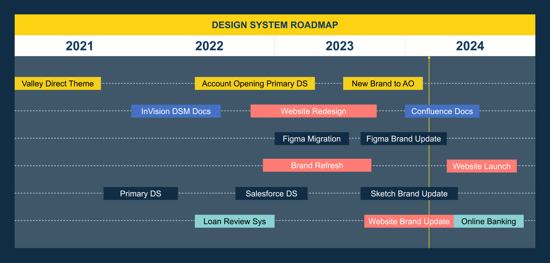
I created roadmaps to provide a clear path for design and implementation, define and prioritize key initiatives, and communicate and align stakeholders across the organization. Creating and implementing a design system of this magnitude—and with a small team, mind you—required multiple phases as Valley’s design maturing and digital transformation introduced new curveballs or opened doors.
Once I hired a team of designers, we established a platform-agnostic parent design system to inform the design of Valley's digital touchpoints.
Late-2021 to Early-2022
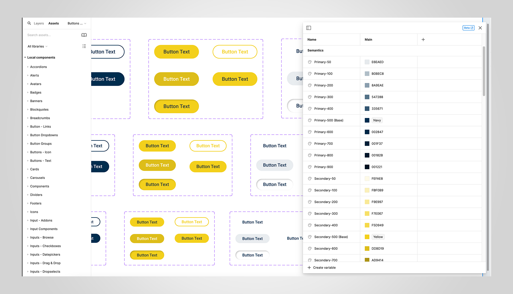
We began the process by translating Valley’s former brand identity to suit digital applications. We introduced the semantic color model, a typography system, and third-party design kits like Font Awesome.
However, Valley has several off-the-shelf solutions that come with their own component libraries and interactions. For example, many components in online banking would never appear in account opening. Therefore, we based our primary design system on Bootstrap, a popular front-end framework with an extensive modular architecture covering many standard components and interactions.
After all, we also had internal applications to work on, so we partnered with the internal tech team to establish Bootstrap as our main framework.
Early-2022 to Mid-2022
For now, we are primarily a Sketch shop (I know, I know). Therefore, the question became: How do we govern our design system? With my team starting to grow, we built initial documentation in an InVision prototype but realized we needed more written guidelines.
I worked with the team to author and implement component descriptions with example images and best practices utilizing InVision DSM. DSM would allow us to maintain a shared library between designers, and we could better collaborate with other technology partners as needed.
Alongside DSM, we established a UX Writing Repository in Airtable to house microcopy, like error messages, notifications, tooltips, and other input field content, to standardize language across all platforms (where possible).
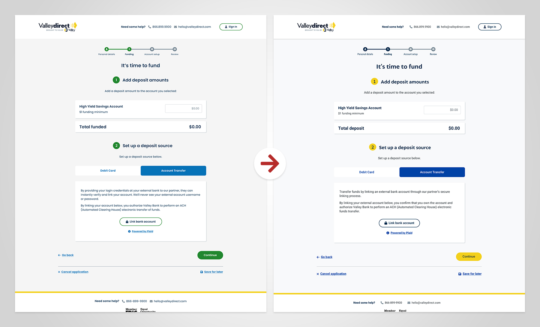
With a more robust design system of components and language, it was time to retire the Valley Direct theme that we carried over all account opening streams to save time. In addition to account opening, we began applying the design system to internal applications.
Mid-2022 to Late-2022
As we closed our second phase, our Marketing partners began working with a tech agency on a website redesign. The agency used our newly established design system to inform the components they’d create for the website, which was hosted on Adobe Experience Manager.
However, the Marketing team not long after engaged a brand agency to refresh our brand identity. That meant we’d be working on a website redesign while the brand agency worked on an identity refresh—yikes!
It didn’t make sense to hold up design system progress while waiting for the brand agency to complete their work. We moved forward with the account opening design system and started gradually changing other off-the-shelf solutions, knowing that fonts, logos, and colors could change.
Late-2022 to Early-2023
Getting ahead of the website redesign, evolving our team’s tools, and learning of InVision’s eventual closure, we began migrating our design system to Figma, utilizing its color variable and variant functionality. Though Sketch has also come a long way, we’ll be using it as we transition, so we gave our design system another pass to refine components and ensure both platforms would easily integrate with the new brand guidelines.
For now, we decided to change logos and colors to accommodate the state of resources (and give the brand some time to land).
Late-2023 to Present
With Valley’s new brand guidelines released, we had our work cut out to integrate them with the design systems we built in Sketch and Figma. I worked with my team to scope, roadmap, task, and translate Valley's new brand guidelines into our existing design system.
The looming retirement of InVision and its sister design system platform meant we’d need to find a new home for the design system’s documentation. With a new set of website components, our design system hierarchy was about to become more complicated.
We are nearing the end of migrating our design system documentation to Confluence to provide cross-functional teams and external partners with easy access to governance, best practices, example images, and other assets they can download.
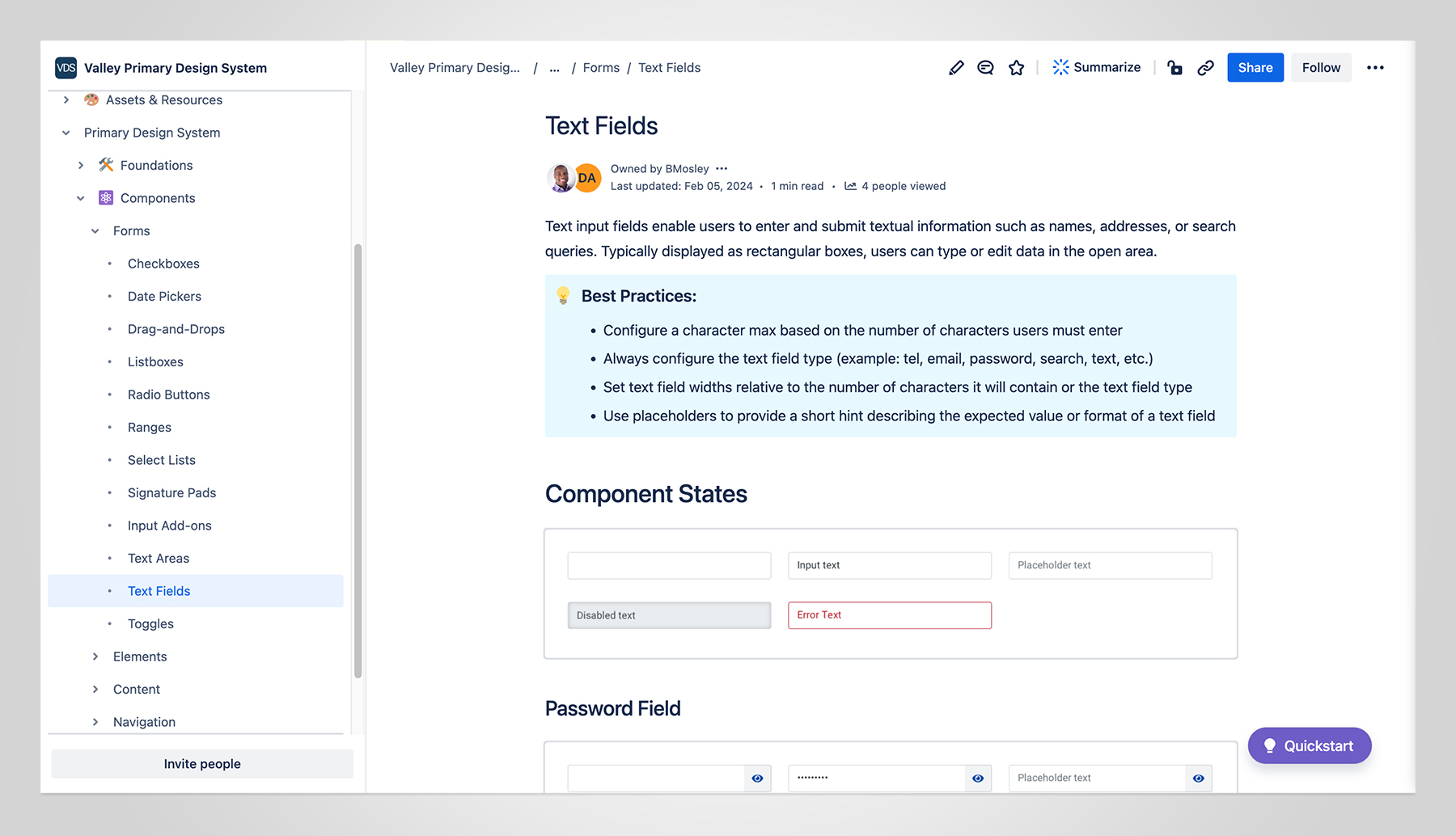
Some may ask, “Why not put the documentation in Figma?” Well, our design maturity is evolving, and we didn’t believe in forcing people to navigate Figma, which is not searchable or user-friendly for extensive documentation. Plus, we agreed that having to “design” pages for documentation in Figma was not a good use of our time; we are a small team with lots to do, and Confluence has plugins that integrate with Figma anyway.
We will have a separate “sticker sheet” to provide high-level or abbreviated style guidelines when necessary. Regardless, we are glad to see how our design system is already significantly impacting the customer experience.