Brandon W. Mosley · UX Leader

Role Product Designer · UX Writer
Partners Client · Digital Strategist · Product · Front-end Engineering
Deliverables User Profiles · User Stories · Sitemap · Wireframes · Design System · High-fidelity
Tools Flowmapp · Axure · Sketch · Illustrator
Timeframe 2 years
Company GeekHive
Running an independent practice with manual processes and a lean staff is time-consuming and overwhelming. YHN members need a centralized digital experience to credential healthcare providers, process claims, and track patient appointments. Smaller practices need supplemental services, such as a call center, to provide better patient service.
"How do we enable hearing health providers to work more efficiently while growing our network?"

The path to understanding YHN’s target users began with learning why the first portal failed to convert. A change of business direction warranted a reprioritization of user personas determined through several stakeholder interviews and workshops.
Practice owners, providers, and office managers emerged as key personas. I captured user behaviors, motivators, pain points, and goals in user personas before defining user stories, which we used to define and prioritize project scope.

A series of workshops and card exercises shaped user flows, navigational paths, and concepts for practice tools. The team collaborated with stakeholders to iterate on concepts for prototyping.


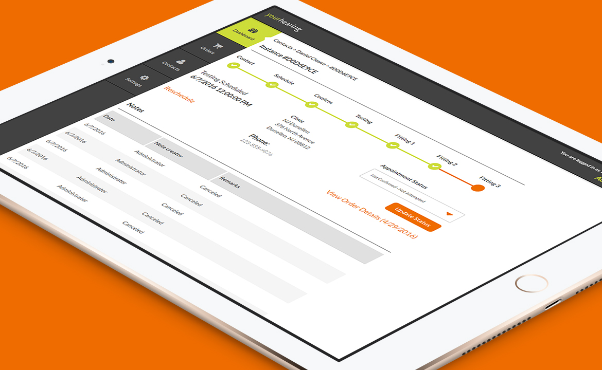
Sitemaps and user flows illustrated final navigation and task paths. These artifacts directed the approach for wireframes, which illustrated information architecture, critical interactions, and how to guide users through task flows.

I translated YHN’s brand identity to a design system comprising of responsive components appropriate for advanced user interactions. Graphs and charts visualized dry tabular data, self-guided tutorials supported user onboarding, and responsible design ensured a consistent desktop-to-mobile experience.


I tested specific wireframe flows with practice owners and back-office users to validate the intuitiveness of the solution. Feedback warranted further simplification of user flows and clarification of system feedback.
During a post-launch beta survey: