Role Graphic Designer · Photo Editor
Work Brand Identity · Print
Tools InDesign · Photoshop
Company In-house
Prospective students consider on average 8-10 institutions to attend during their college search. They are often inundated with marketing materials while finishing a busy and stressful senior year of high school. Students need clear and consistent messaging that answers critical questions about their college of choice.
A narrow and outdated visual identity led to an inconsistent look and feel across print and digital customer touchpoints. Prospective students and their parents often confused the Connecticut College with UCONN and perceived it as undiversified, preppy, and too expensive.
“How can we better tell prospective students about why the college should be their first choice?”
"How can we regain control of our brand identity as we reach our centennial?"
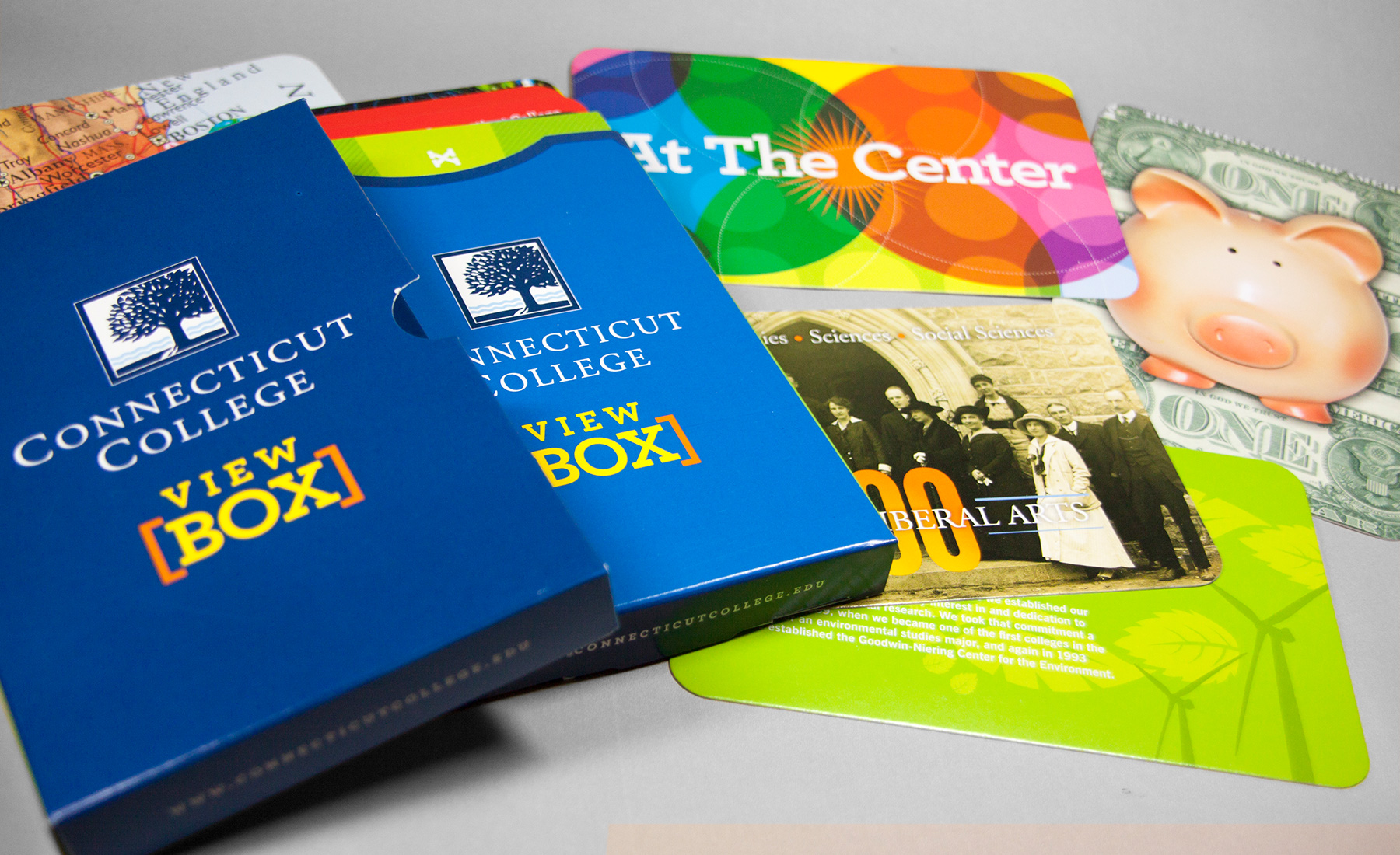
I adapted the look and feel from the “Viewbox” produced by another agency to new and existing admission publications. Part of my strategy involved directing a lifestyle photographer to capture a vibrant campus life to tell a story through pictures, not just words.


Partnering with the third-party agency that designed the initial Viewbox, we tested the box of cards with prospective students in Boston. As we sat behind mirrored glass, we watched high schoolers open the box and sort the cards before consuming their content. From this process, we decided to:
Over several years, the content and imagery of the Viewbox evolved based on additional learnings, the college's forthcoming centennial, and changes in the higher-ed market.
